Before you buy something in a brick and mortar store, you interact with it. You test drive cars, you touch blankets, you smell candles.
In ecommerce, that interactivity is missing, which puts a lot of pressure on product photos to fill the void.
Fortunately, your brain can process images in as little as 13 milliseconds. It can remember more than 2,000 images with 90% accuracy over the span of a week.
So product photos have a bit of a competitive advantage when it comes to capturing attention and creating memories.
Product photography can be used to persuade, influence, motivate, and direct attention. Product photos are lean, mean selling machines and they deserve your undivided attention.
The following tests and studies will inspire you to test your own product photos and unlock their hidden persuasive power.
1. Required: size-comparison product photos
Karl Gilis of AGConsult is a usability and conversion optimization expert. That means he conducts a lot of user testing and usability research to better understand buyers and how they shop online.
His number one tip for using product photos to persuade and influence buyer behavior? Always show at least one product photo that reveals how big or small your product actually is.
Karl explains:

Karl Gilis, AGConsult
"The first time I realized this was about 15 years ago when moderating a user test for a handbag brand. People loved the images, but they missed one thing: a reference to size. Although every product page mentioned the dimensions, the users wanted to actually see how big the product was.
Since then we’ve observed this many times: people want to have a visual concept of the size. The easiest way to provide that is by including a human element (for example, a hand that’s holding something) for reference.
One of my favorite examples comes from a company that sells flowers and plants for your garden. For every product, they have an illustration that shows how big the plant is when you buy it and how high it will grow:
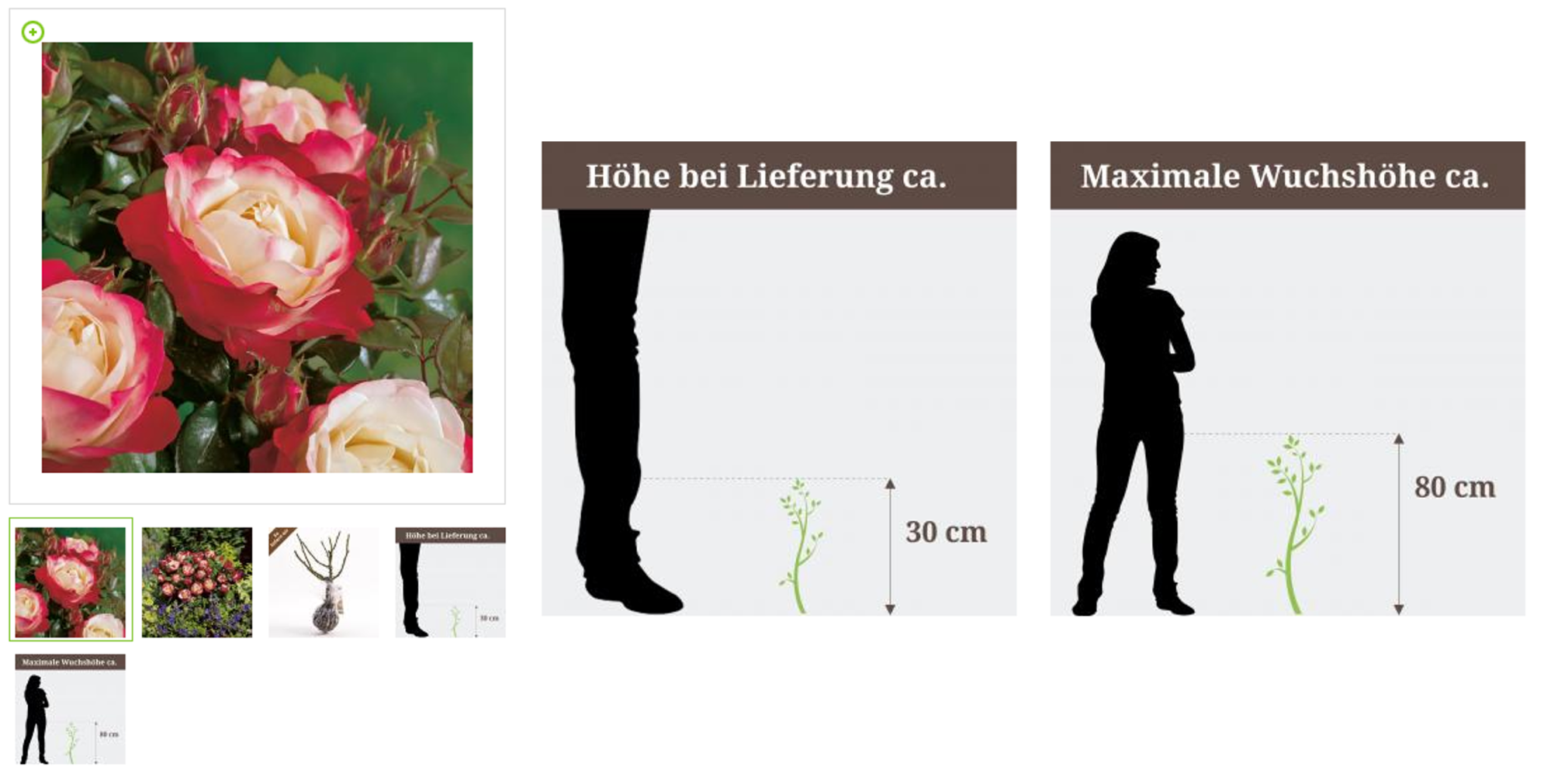
But you can also accomplish this by putting the product near something everybody knows. For example, a kitchen robot next to a cupcake. Or that poster you’re selling above a couch in a living room. Or a fruit basket (with fruits) on that kitchen table you’re selling."
Without size comparison product photos, your customers will end up like Adam here:
Bought a rug online for my room & realised the importance of specifying the size of the product you're selling pic.twitter.com/0DQuqRN96g
— Adam Hess (@adamhess1) June 10, 2016
Take Tattly for example. Here’s a “Mixed Emotions Club” temporary tattoo:
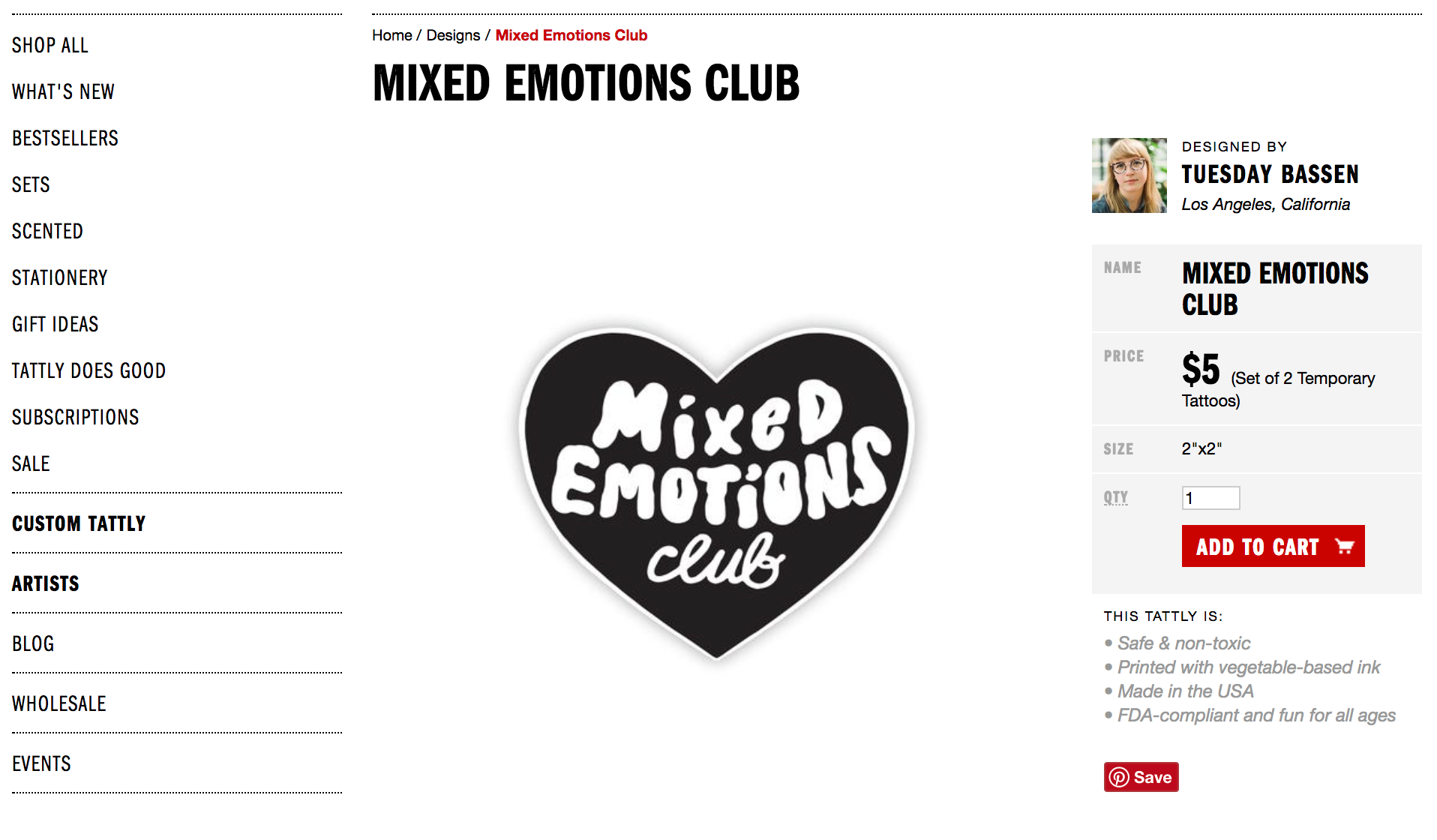
You’ll see along the right that the product is 2’’x2’’. Break out your tape measure, hold it up to your arm and voila. But why complicate things, why create extra work for your potential buyers? That’s what’s known as friction.
Instead of creating work for the visitor, Tattly offers some comparison product photos, like Karl suggests:
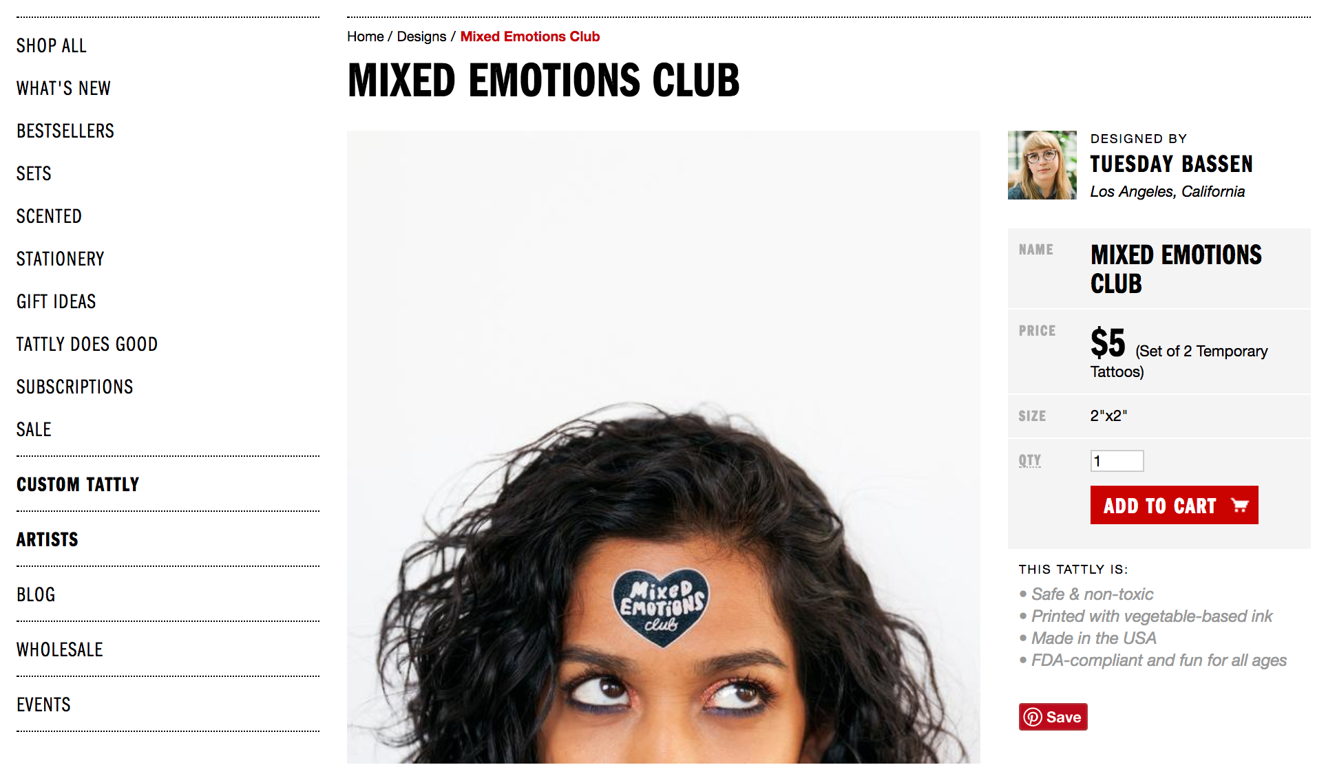
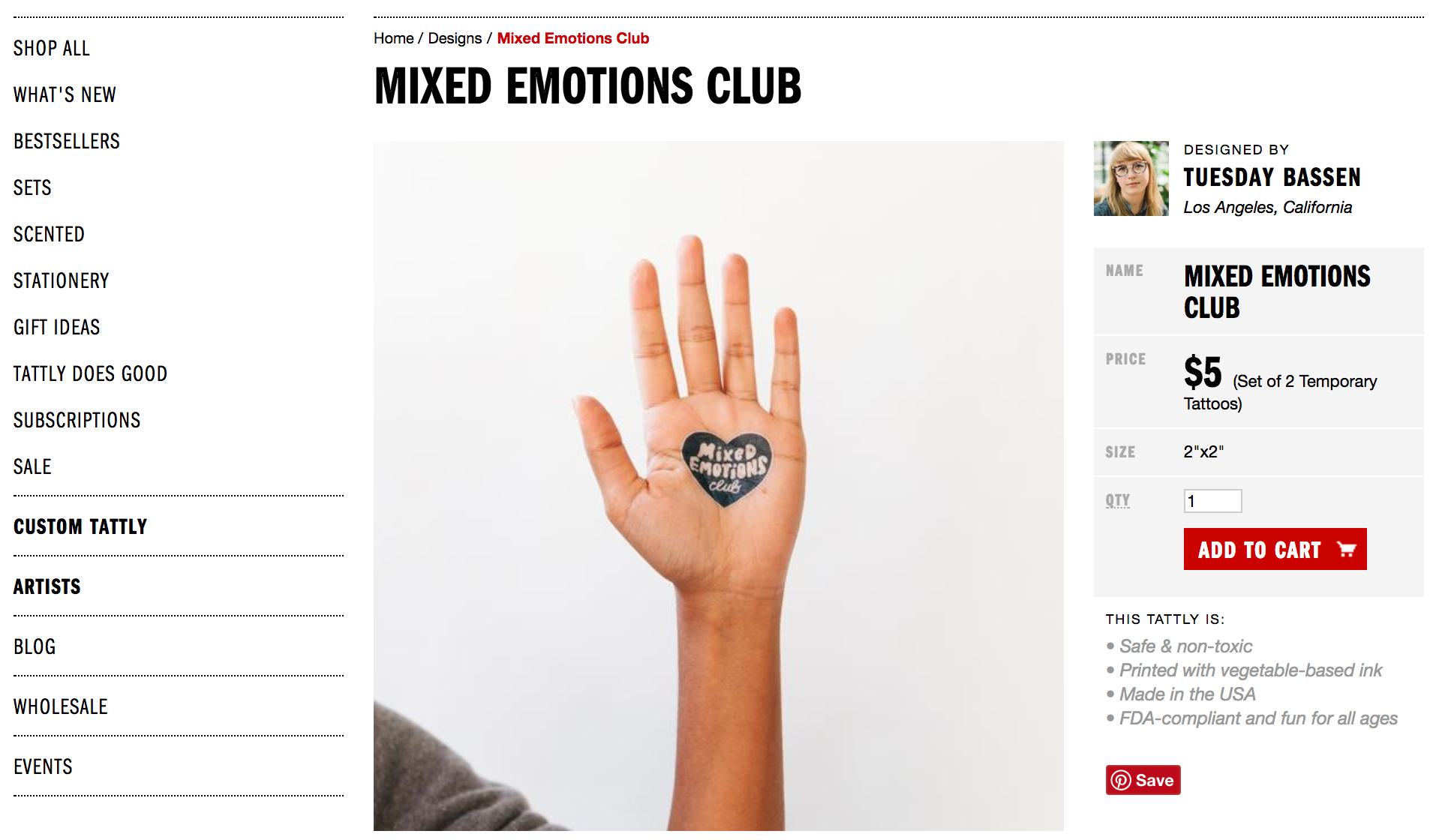
The tattoo on her forehead hints at the size of the tattoo. But what if her forehead is bigger or smaller than yours? Well, here is the tattoo on the palm of her hand:
And her arm:
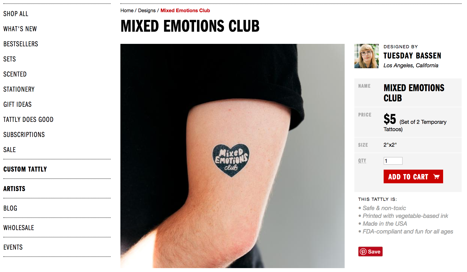
You get the idea. All of these size comparison product photos create context and set size expectations much more effectively than the 2’’x2’’ product spec.
2. A smile isn’t the be-all-end-all of Product Photography
Karl also shared the number one mistake he sees people making when it comes to ecommerce product photography: showing happy people in every image.
You see, back in 1993, Murphy and Zajonc conducted a study. They showed subliminal smiling and frowning faces to participants. Participants exposed to the smiling faces evaluated the associated stimuli more positively than participants exposed to the frowning faces.
The conclusion? Even minimal stimulus input (i.e. a smiling face) and virtually no cognitive processing (the facial expression images were flashed so quickly it was considered subliminal) can impact the perception of unrelated stimuli (i.e. a product).
So, basically, show a picture of a smiling person and your product will be viewed more favorably.
This all ties into a cognitive bias known as the chameleon effect, which states that people tend to unconsciously mimic the postures, mannerisms, behaviors and attitudes of others. It’s why someone else’s bad day can ruin yours or why someone else’s drive can push you to finish a project of your own.
Somewhere along the line, that study morphed into a best practice in ecommerce. All product photos shall contain a smiling face. Hey, it worked for Basecamp, right?
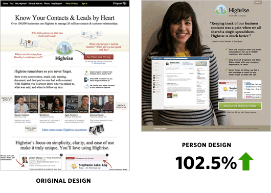
As Karl explains, though, this isn’t a hard and fast rule. In fact, it backfires more than you might think:
Karl Gilis, AGConsult
"It’s not necessary to include a human in every single image. When you sell air conditioners or furniture or holiday homes, you don’t have to include happy people in every photo. Especially if they’re photoshopped models. Honestly, the average customer is becoming immune to it.
More importantly, those human models are more often a distraction. They take the focus away from the product. It’s about the couch, not the model. If I’m looking for a holiday home or a hotel, I want to imagine myself relaxing there.
This photo illustrates what I mean:
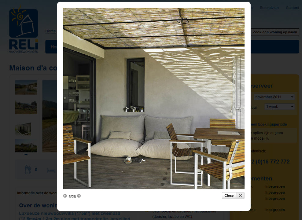
It includes a cup of coffee and a book, so I can imagine myself sitting there and enjoying that beautiful holiday home. If somebody else were sitting on ‘my couch’, this product photo would not have the same impact."
Instead of showing a smiling person, allow the visitors to picture themselves in the scenario. Ratio Coffee does a great job of this:

You’ll notice that you can actually flip between different kitchen styles (e.g. modern, contemporary, traditional), depending on your interior design preferences:
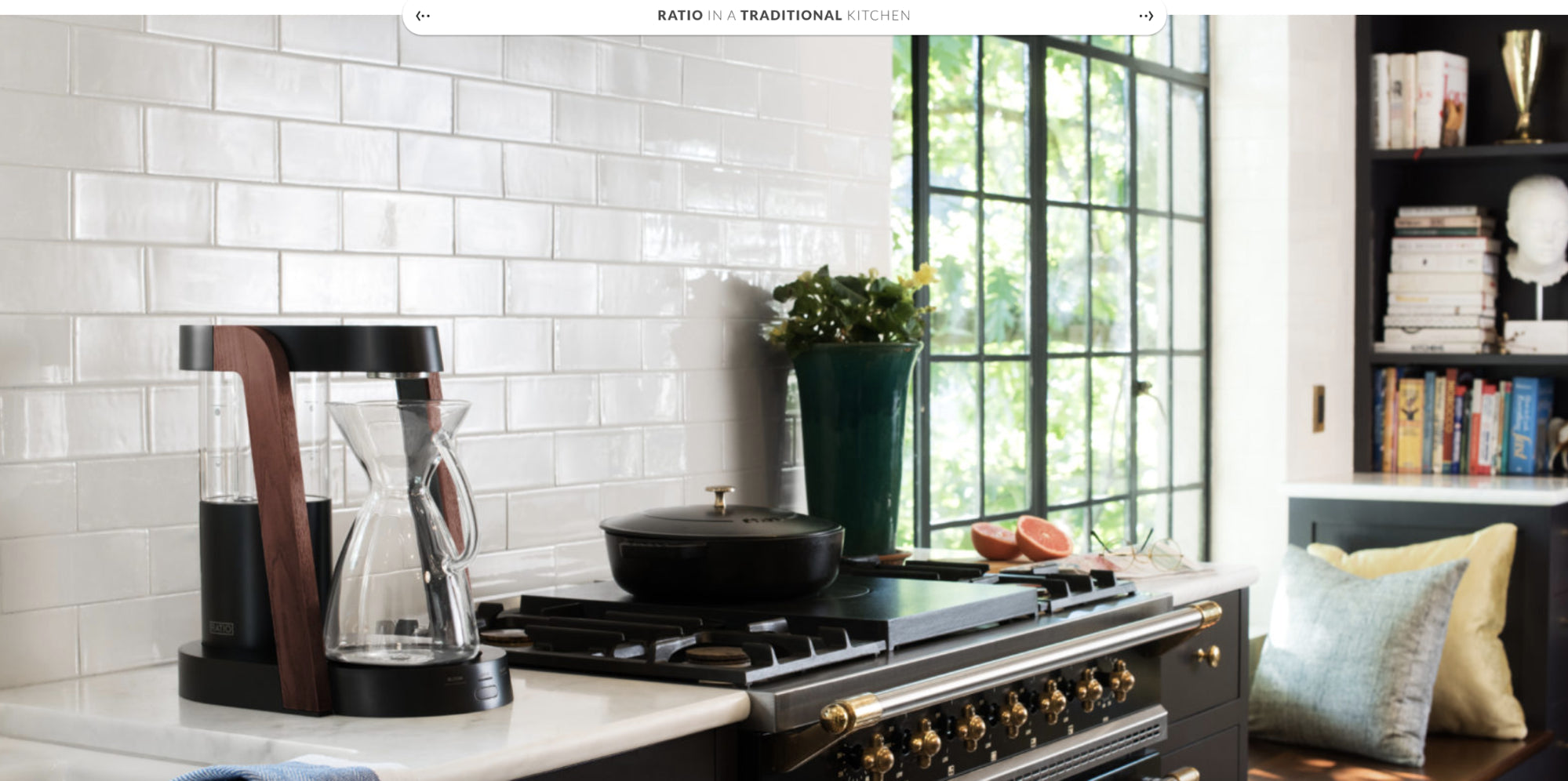
Not only are there no smiling faces around, but Ratio makes it even easier to picture yourself, well, in the picture by allowing you to choose the kitchen design that best matches your own:
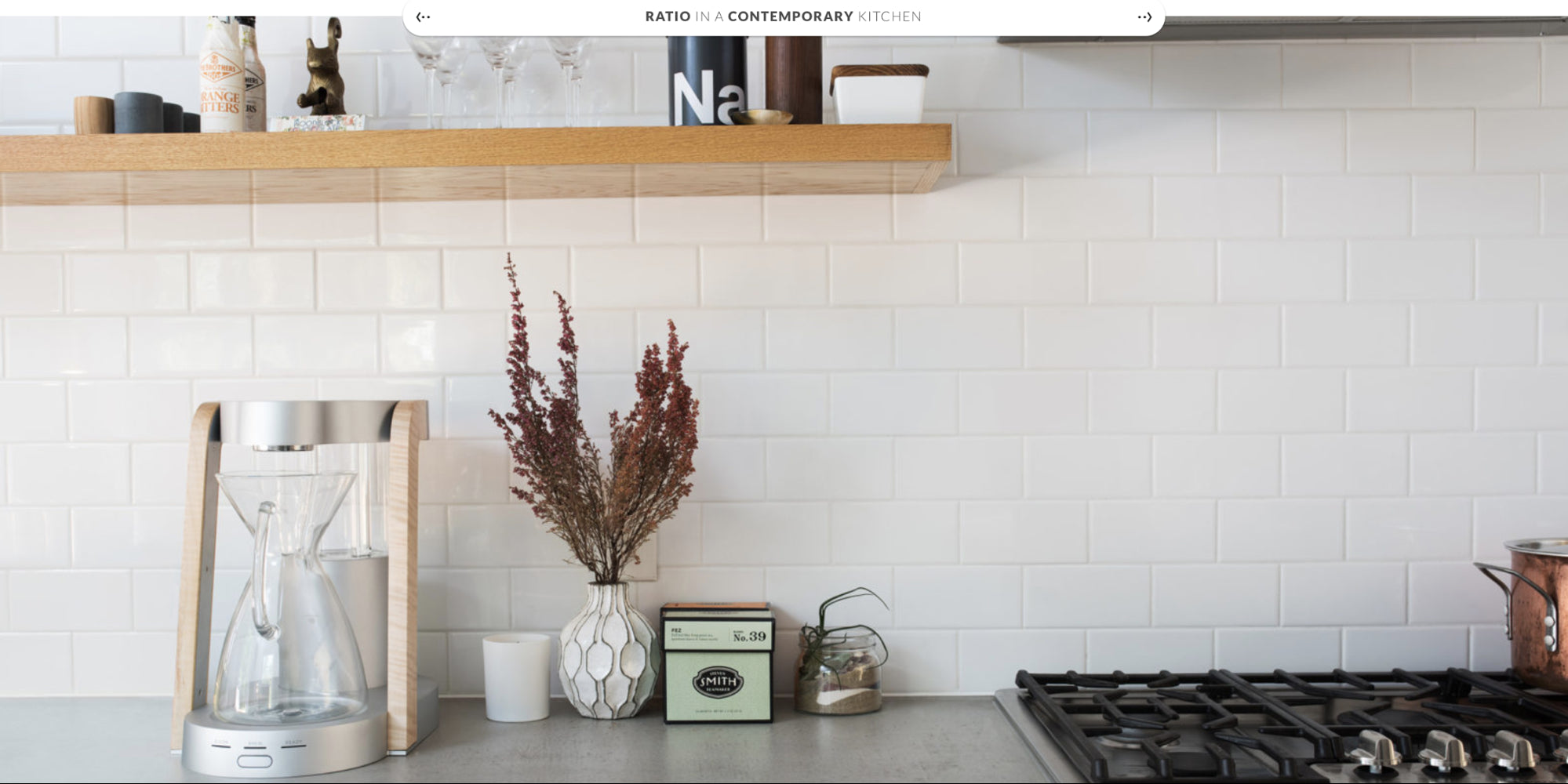
This same philosophy carries over to Ratio’s product pages:

A smile can be a powerful persuasion tool, but it can also clutter up the lifestyle you’re trying to sell. There’s no room for your potential customers in a product photo if it’s crowded by models.
3. Authentic product photos convert
GoodUI has curated over 100 test results and used that data to establish patterns. Jakub Linowski, one of the founders, shared the results of a recent product photography test with me.
The test explores the impact of user-generated product photos. Would they increase adds to cart? Would they be more persuasive than traditional product photos alone? Yes, actually.
Here’s the control (A) and the variation with social proof in the form of user-generated product photos (B):
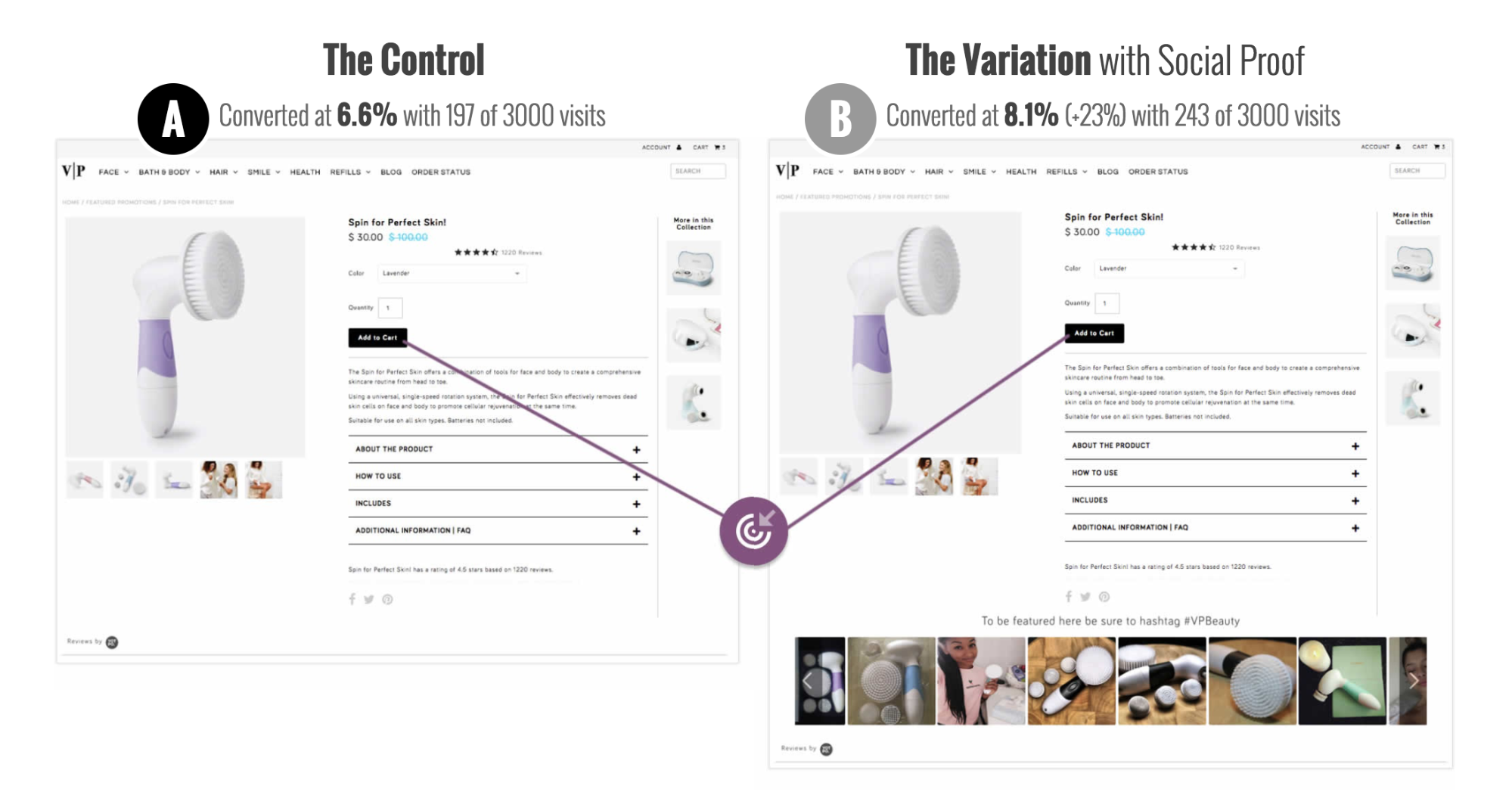
The control converted at 6.6% while the variation converted at 8.1%. That’s a 23% lift.
As Jakub explains, both authenticity and social proof are likely at work here:

Jakub Linowski, GoodUI
"The interesting change in this A/B test is an introduction of authentic customer-submitted product photos. I think that authenticity is one quality to which we could attribute part of the positive impact.
By showing customer-submitted photos, the tested variation also might have become a form of social proof. In the end, the photos show that real customers have ordered this and were happy enough to share that with everyone else."
User-generated product photos strip away the flattering lighting and the meticulously placed auxiliary products, which makes them appear more authentic than your more perfected shots.
They also offer a form of subtle social proof. “Hey, it’s ok to buy this product. I did and look how much I love it.” The best part is that this form of social proof is actually useful to the buyer, it’s not purely self-serving.
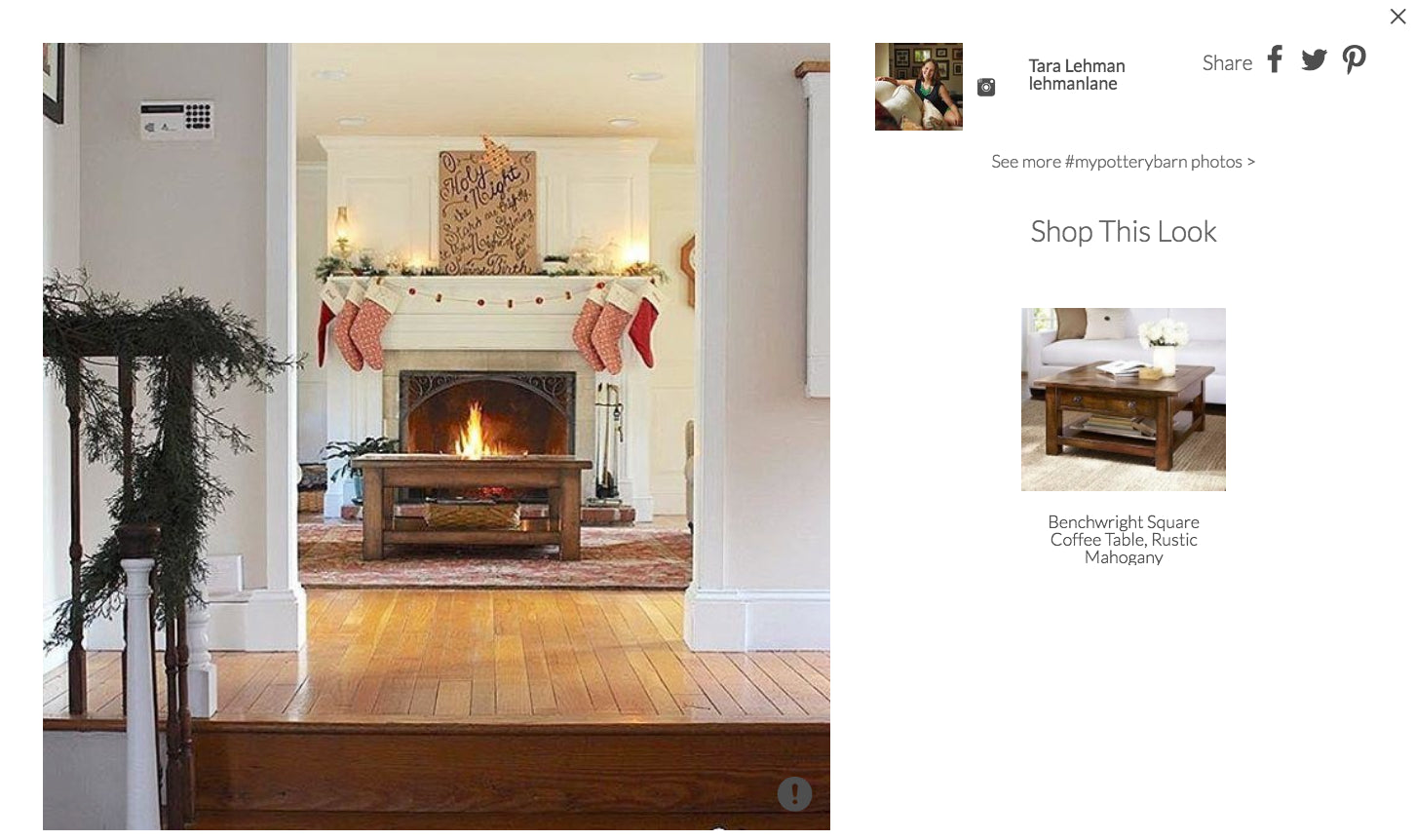
Pottery Barn uses user-generated product photos, for example:
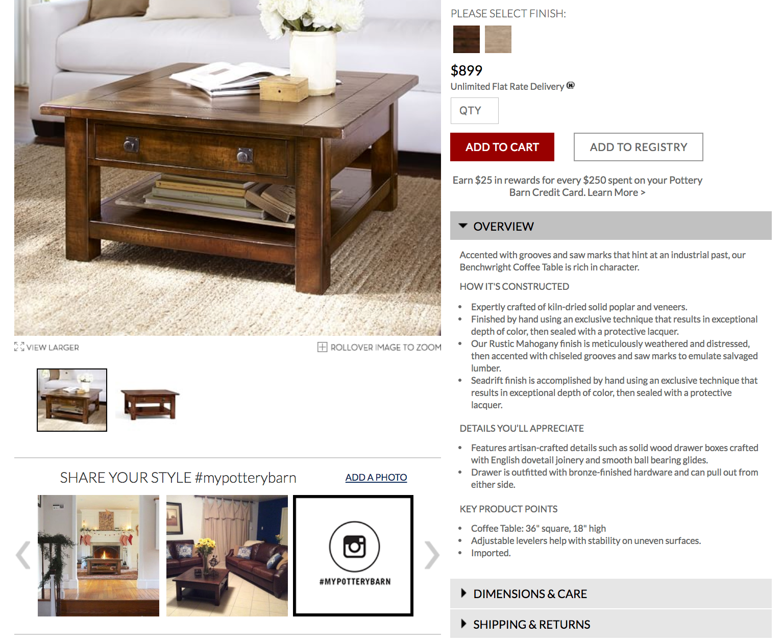
The standard product photos, produced by Pottery Barn, are where you’d expect. The “SHARE YOUR STYLE #mypotterybarn” section is for the user-generated product photos. You can click them to see the product you’re considering in the homes of real buyers:
4. Does size really matter?
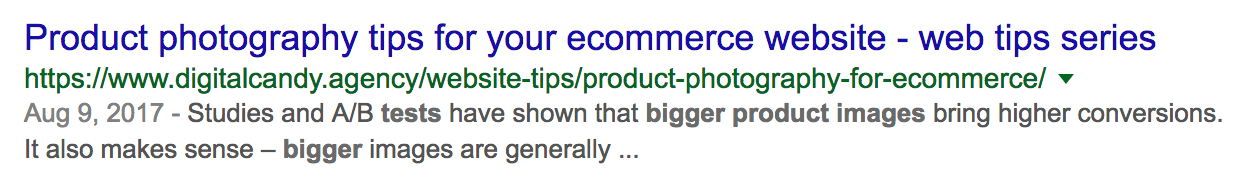
Chances are you’ve read that bigger product photos mean bigger conversion rates. It’s become somewhat of a best practice in ecommerce:
The team at CXL Institute wanted to put that best practice to the test. They ran two different studies, one to explore how product photo size impacts engagement and one to explore how product photo size impacts value perception.
Ben Labay, Research Director at CXL Institute, summarizes the results:

Ben Labay, CXL Institute
"The bottom line or tl;dr here is that user perceptions can change according to variables of the type of product viewed, and how or what context the product is viewed.
In the engagement study, we found differential results among vastly different product types (dress shirt vs. headphones vs. hardrive).
In the value study, we found a counter-intuitive result: the perceived value of a shirt actually decreases with a larger image. Our hypothesis here is that it’s not the smaller image that increases price perception, but the increased white space that results from decreasing the image size, providing a more minimalist version of the page."
But let’s dive in a bit deeper.
Engagement
Do bigger product photos get more attention? That was the question the study set out to answer.
First, let’s take a closer look at the products used in this study:

You’ll notice these three items are very different. On the left, we have a men’s dress shirt, which is a design or experience product. On the right, we have a hard drive, which is a search or spec product. Headphones fall squarely in the middle of that scale.
Ben and the CXL Institute team used eye-tracking to measure engagement:
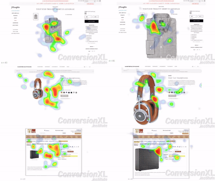
The results?
Engagement increased as the image size increased for the search or spec product (hard drive). Engagement decreased as the image size increased for the design or experience product (men’s dress shirt), though.
Value
Can product photo size impact the perceived value of the product?
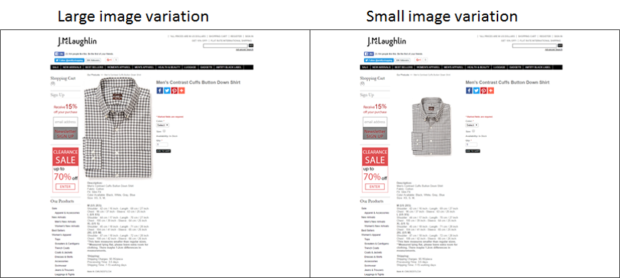
To answer that question, Ben and co. designed a few different variations. Here are two of six design or experience product variations:
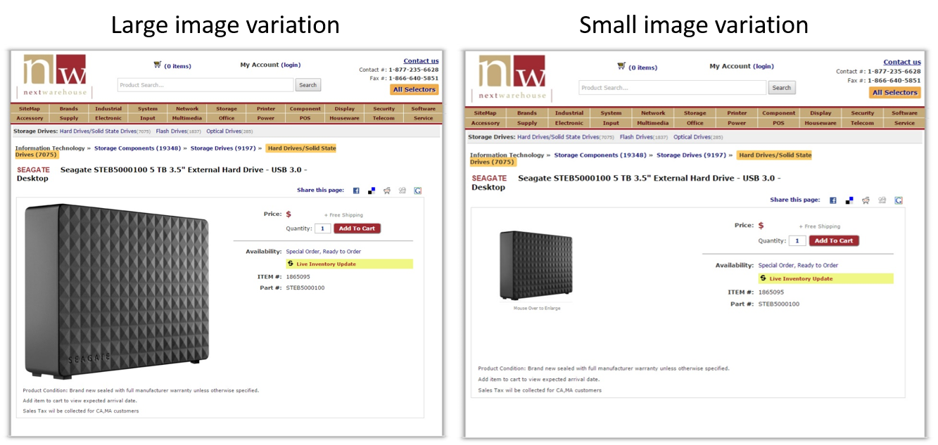
And here are the only two search or spec product variations:
To understand value perception, two questions were asked:
- At what price is this product a bargain?
- At what price is this product too expensive to consider?
The results?
The average perceived value increased with product photo size for the search or spec product. The large image of the hard drive was perceived as $13.50 more valuable than the smaller image on average.
The average perceived value decreased with product photo size for the design or experience product. The large images of the men’s dress shirt were perceived as $1 less valuable than the smaller images on average.
The moral of the story is to avoid best practices and run your own tests. Everything is contextual and the type of product you sell matters a lot. As Ben mentioned, increased white space is worth testing for design or experience products.
5. Auxiliary products matter, too
Auxiliary products are often found in what are known as inspirational product photos. Here’s an example of one from IKEA:

The primary product in this photo is the exhaust hood, right? It’s the only product that’s labelled. But the entire kitchen is full of IKEA products.
Imagine how frustrating it would be if you saw this product photo and fell in love with the barstools. Are they from IKEA, too? How much are they? Are they in stock?
Now you have to go searching for a specific barstool, probably flipping back to this product photo again and again to find a match you’re not even sure exists. Yikes.
But the match does exist. Here’s the barstool:

Why not link through to the barstool and the other auxiliary products? Why bother inspiring visitors if you’ve made taking action so difficult?
These are questions Baymard Institute explored through user testing and usability research.
They watched over and over again as test subjects became frustrated with inspirational product photos. The product photos worked, they inspired potential buyers and created real desire. The follow-through was just so unnecessarily difficult, though.
According to Baymard, many sites with inspirational product photos don't link through to products at all (e.g. a product page photo shows the product in an inspirational setting), others merely link through to a category page (e.g. kitchen).
In fact, only 36% of the top 50 ecommerce sites currently link to the depicted products in their inspirational images.
Wayfair, for example, marks up their inspirational product photos to close the inspire-purchase loop:
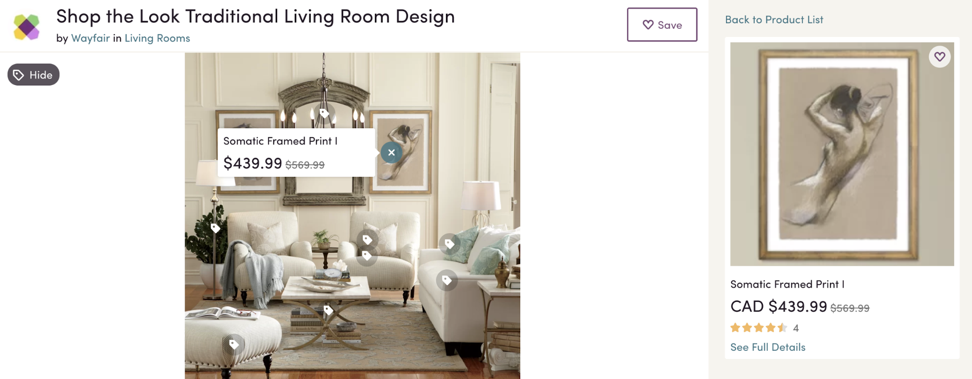
Just click on a muted price tag icon and you’ll be shown the corresponding Wayfair product.
Don’t leave your “shop the look” enthusiasts hanging with inspirational product photos.
6. It’s all about the product details
Nielsen Norman Group found that visitors pay close attention to photos that contain relevant information, but ignore fluff photos.
During a series of 2010 eye-tracking studies, NN/g sought to understand why some product photos grab attention and persuade while others just take up valuable real estate. You might assume that product photos are always among the former, but that just isn’t true.
Why? Because not all product photos are created equal.
Here’s an example to illustrate:
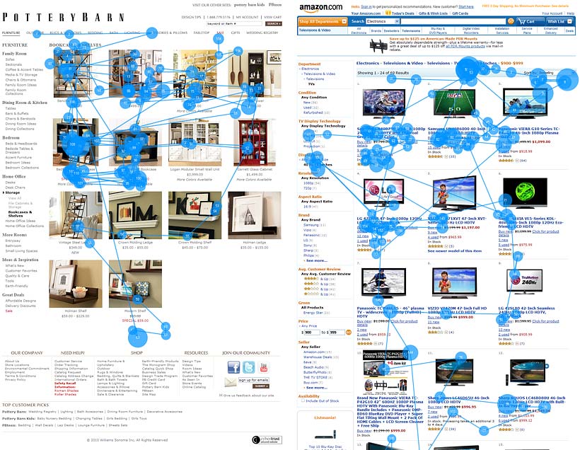
The product photos on Pottery Barn’s category page attract and hold attention much more effectively than the product photos on Amazon’s category page, right?
Only 18% of the viewing time on Amazon’s category page was spent on the product photos. 82% was spent on the text. On average, each product photo got 0.9 fixations while each text description got 4.4 fixations.
It’s not hard to see the difference. Pottery Barn’s product photos offer more product detail than Amazon’s.
It’s not going to be a picture of a football game that sells the TV, it’s going to be the product specs (thus, the high average text fixations). No buyer is going to make a meaningful comparison using the TV product photos. For Pottery Barn, the opposite is true.
Being able to offer more detailed, more informative product photos than sites with a huge catalog, like Amazon, is a competitive advantage. The study is old, but the insights are evergreen: the more informative and detailed your product photos, the better. Capture details during the shoot and use photo editing software to fine tune during post-production.
Conclusion
Your product photos are capturing people’s attention and sticking with potential buyers for days, whether you’re optimizing them or not.
Don’t fall into the set it and forget it trap. Your product photos are a high impact sales tool and they’re affecting your bottom line, so pay attention to them long after they’ve been shot and selected.
Your visitors will.
Shake off the product photo best practices. Use the tests and studies above to inspire your next product photography A/B test.
Read more
- Saving Your Images for the Web
- How to Color Correct Product Images in Adobe Lightroom (and Minimize Returns)
- How to Create Beautiful (and Persuasive) Hero Images for Your Online Store
- 40 Tools and Resources For Creating Beautiful DIY Product Photography
- 5 Easy to Use Online Logo Makers to Design Your Brand
- Remove the Background of Your Product Photos with These 4 Editing Tools
- How to Protect Your Brand From Identity Theft Online
- Is It Possible To DIY My Ecommerce Store Design As A Beginner?
- How to Create Minimum Viable Brand Guidelines (And Why They'll Improve Your Marketing)